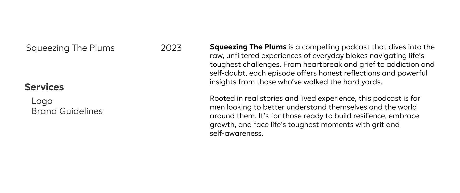
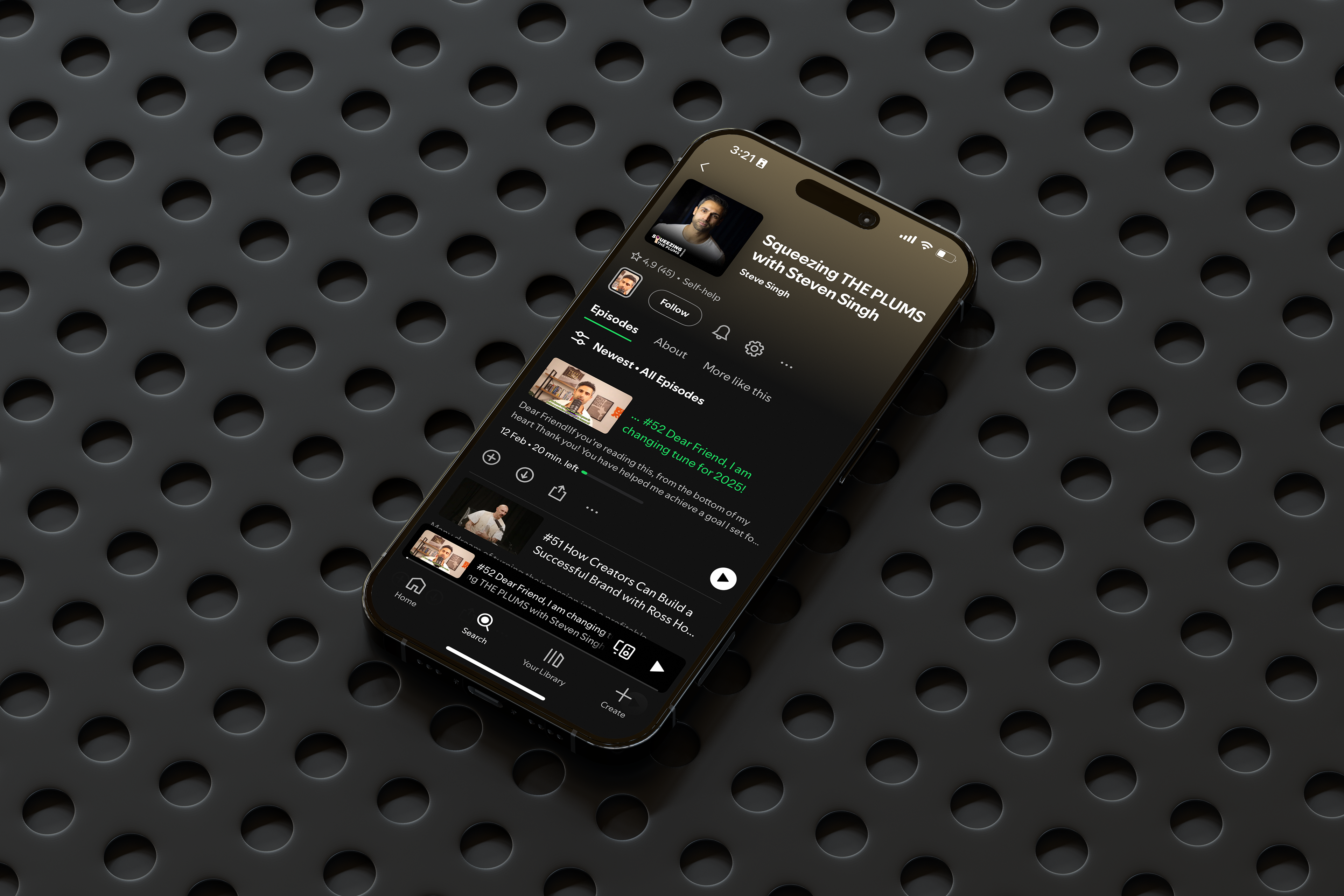
Check out the Squeezing the Plums on Spotify, a project proudly developed as part of my work at Neon Treehouse.

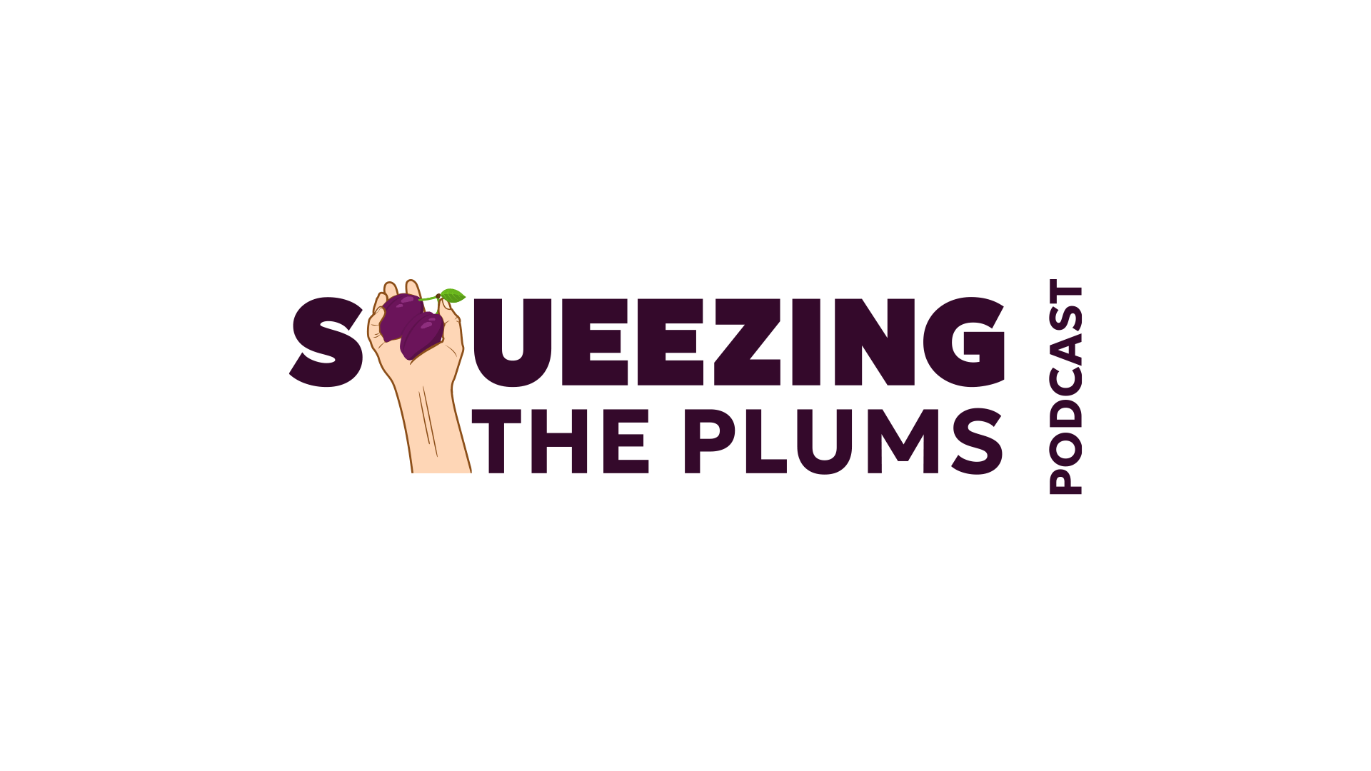
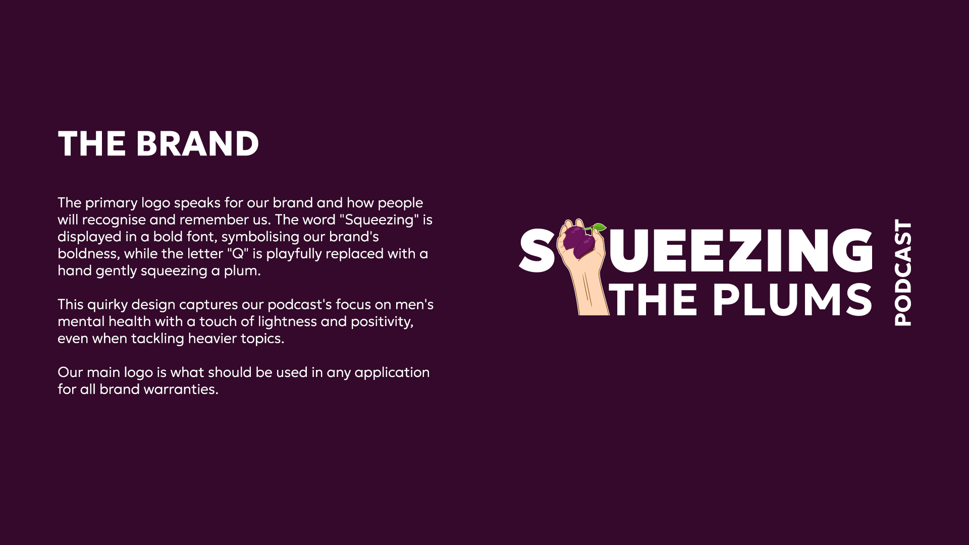
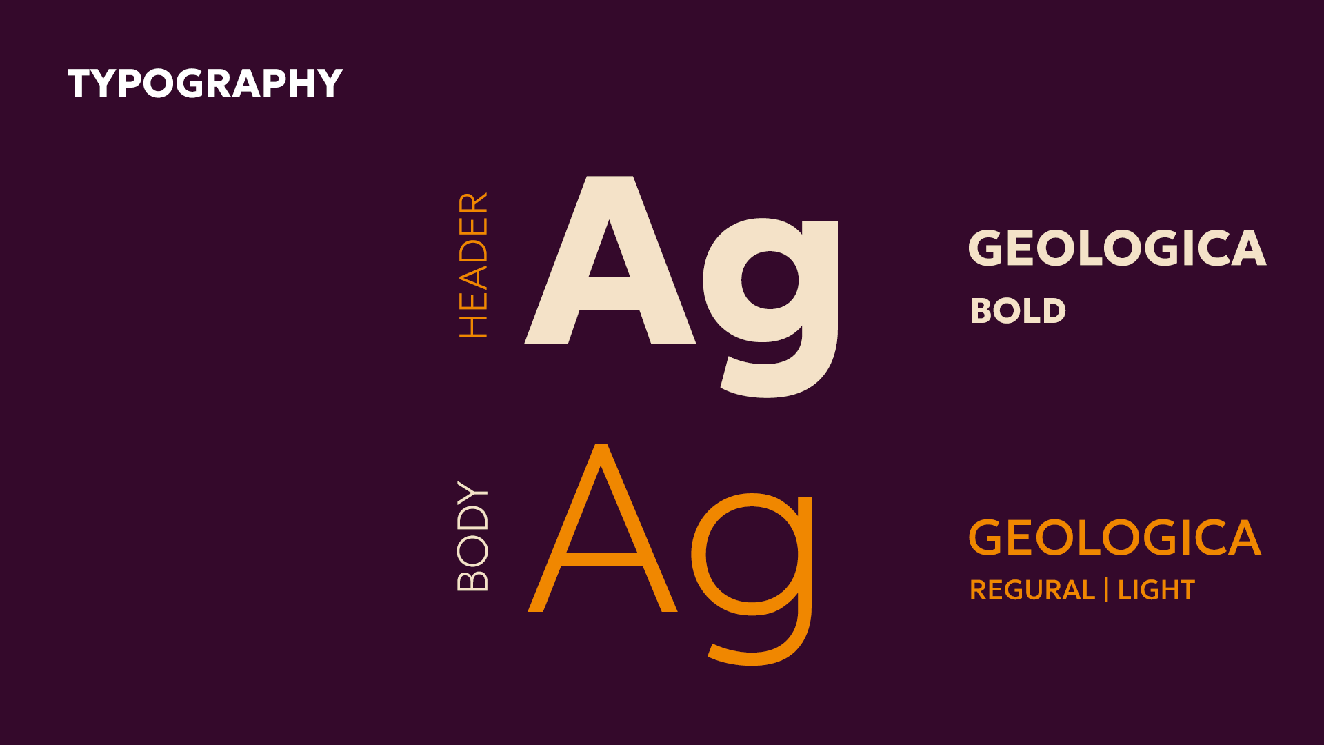
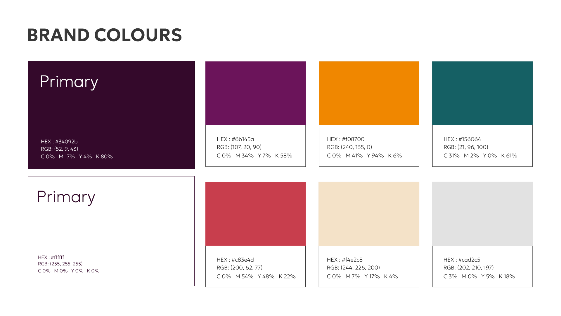
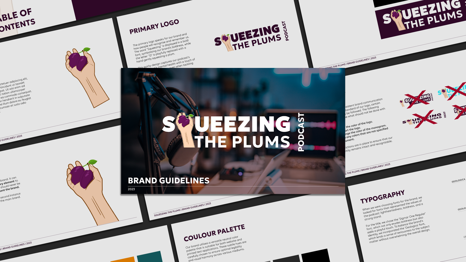
As Head of Creative at Neon Treehouse, I was responsible for designing the logo, selecting the colour palette, and developing the brand guidelines for Squeezing The Plums. The goal was to build a distinctive and cohesive visual identity that reflects the brand’s values and resonates deeply with its audience. A key feature of the logo is the hand gently squeezing a plum instead of the letter “Q” — a playful, memorable detail that adds a light-hearted touch to the podcast’s honest conversations around men’s mental health.